
How to visualise the hidden aspects of language?
Such as emphasis or pauses - whether it be mid-sentence or mid-word. The initial explorations used a combination of text and symbols within one space. While I had hoped to show the contrast of where the punctuation was within the text and where the verbal parts were played out alongside, another factor I did not consider was the timing of the audio with the text. If full words appeared during enunciated parts, the flow of reading would be interrupted. I also found that there was a discourse in the viewer individually reading the words before hearing the style in how it was narrated. This is when I knew I needed to abstract it further and only show the movements of how these edges worked.
After this, there was a point where I was stuck with how to visualise the hidden qualities of language. Using a section of audio of Stephen Fry narrating Hitchhiker’s Guide to the Galaxy, I undertook an process of exploration to see if data bending could convey a sense of this and whether data bending provided a meaningful outcome. These were the questions that became present in the beginning of my explorations with the audio file.
What is databending?
Data bending is a practice where you take one data type and ‘bend’ it into another. In this case for example, I had taken audio as mp3 and ‘bended’ it into an image. The steps that were taken into altering this file into the data visualisations involved the use of both Audacity and Photoshop.
1. Import audio into Audacity
2. Export as ‘Raw Data’
3. Open the .raw file on photoshop
4. Analyse - what comes out of it?
5. Repeat
So what came out of it?
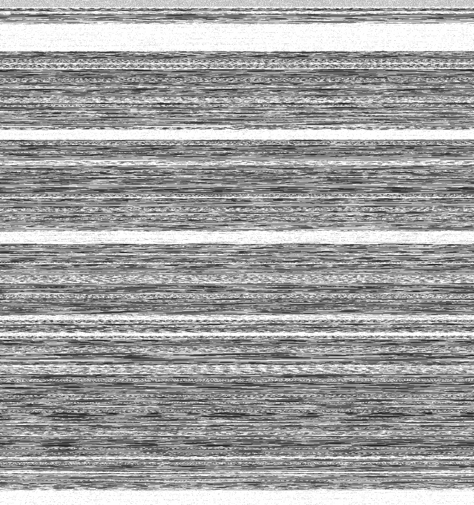
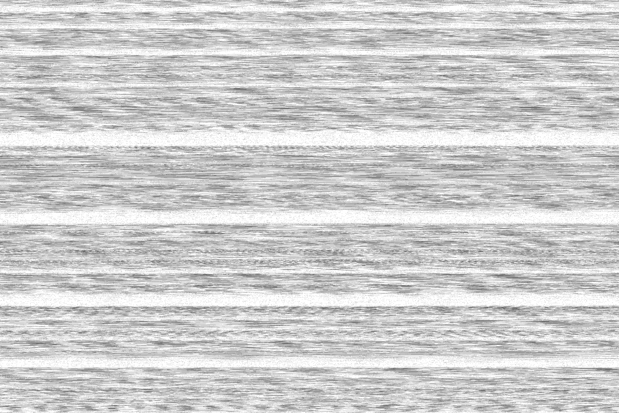
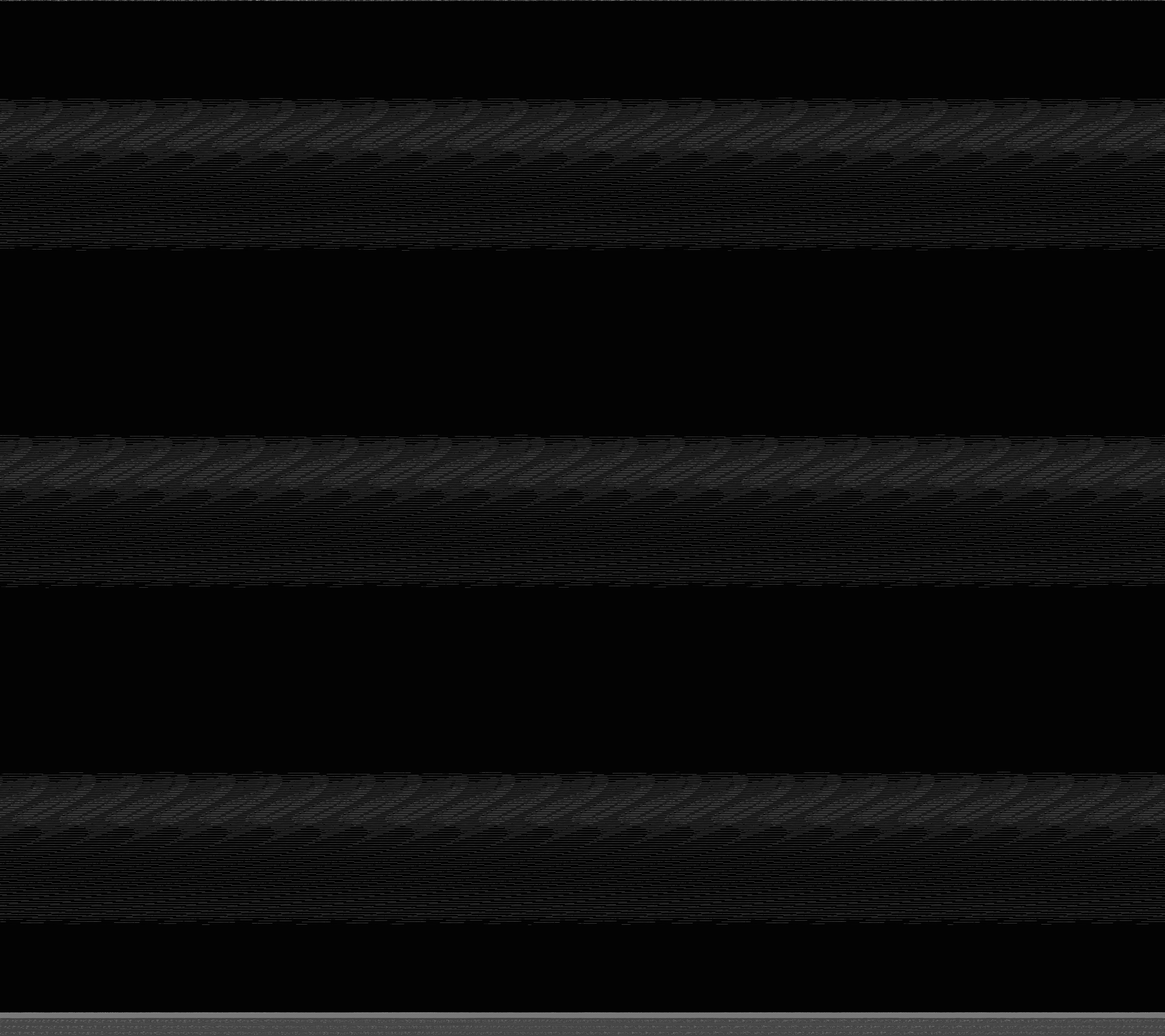
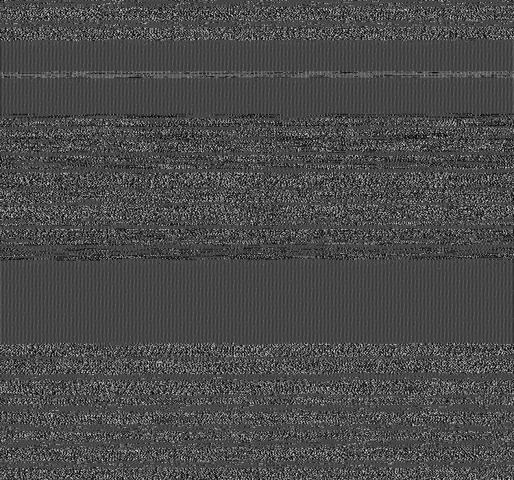
My initial analysis involved looking at the different textural qualities of the data bending image to determine what parts of speech they related to and what was revealed through this. I discovered whiter spaces translated into parts of audio that were silent or close to silence whilst the darker, inscripted parts were notions of speech and sound. The rhythm of the audio could be seen visually through the pacing of the grey and white sections, where I was able to determine where the sentence started, ended and where there was dip in sound, which conveyed the highest points of sound - mainly being parts of emphasis in a word or sentence.
After analysing the data and discovering the edges within the dataset, I sought to portray the movement of these qualities in a video format. Bringing it into After Effects, I started to play around with certain parts with highlighting sections, zooming in and out or cutting up the audio to only display one quality with different visualisations.
The method of how I had conducted these explorations of the data, started to embody a spatial quality to the image where I became inspired to turn this dataset into terrains and landscapes, I explored different perspectives of going through and across in different angles, having certain parts rise up and down and other static appearances, but I concluded the most effective way was to simply move through the terrain as the related data would appear in time with sound. This would allow us to follow the narrative of the dataset, understanding the relationships between each segment as we go across.
Below are initial experiments and iterations - some didn’t work out, some paved way to the explorations presented. (More to come)
.
.